A Journey of Pain
(A lot of...) Pain 💦 + Reflection 🤠 = Survival 😬
This is a making-of article that demonstrates the work behind the scenes for my data-driven project Florida's Non-medical Abortion Costs
Swipe Right →
overview
2022 saw the historic overturning by the U.S. Supreme Court of the landmark Roe v. Wade, which has dramatically raised concern about the accessibility to abortion services in the states of Deep South. Abortion still remains legal in Florida. However, a new state law of a 15-week ban with limited exceptions is now in effect.
In order to explore the financial impact of Roe's overturn on Florida's abortion access, the project tried to analyze the state's non-medical abortion costs including transportation and lodging expenses for a round trip, based on self-collected statewide abortion facility datasets, combined with interactive infographics features.
This project was my capstone thesis for the Journalism Graduate Program at the University of Miami, instructed and supervised by Alberto Cairo, Vinicius Sueiro, and Luis Melgar. The project was first published in October 2022, taking me about four months to result in such a full-fledged data-driven news story. I own the solo byline for this project.
ideas
Before I decided to write a story about Florida's abortion costs, I killed two ideas during my preliminary research stage. My first story idea was to talk about how birth control and abortion pills industry would respond to the overturn, which could be a really exciting pitch to dig in if with reliable and accessible data.
However, when I delved into the subject, my assumption that there might be some data of sales fluctuation for contraceptive pills after Roe, was not supported by any findings or public databases since most sales numbers were restricted and commercial wise. (OK...now I see why such an interesting pitch hadn't been touched upon by many news outlets from a data perspective —— most of them were only interview-based news reporting stories).
So, I have to give up the idea and looked for other alternative story directions. When I randomly searched into Florida's abortion facilities on Google Map, I discovered that many of them had low ratings, mostly below 4.0. Upon reading some negative reviews, I learned that patients were dissatisfied with the abortion services they received, which led me to assume that women in Florida may not only face challenges in accessing quality abortion care, but also have limited options for higher-quality facilities.
I spent about two weeks formulating this idea and began scraping and analyzing negative reviews of a sample abortion facility to understand the issues people had with the service and the overall service quality. However, I failed to spot that the data might be falsified. When I first discussed the idea with Professor Cairo, he cautioned me that there was a possibility of the low stars and negative reviews being partially fabricated by people like anti-abortionists(?).
In real world, raw data can be chaotic. A lack of data accessibility may prevent you from going deeper in a topic while weak data reliability would result in worse trust crisis between the writer and the readers.
proposal
After spending the entire month of August discarding ideas, I felt desperate ☠️. I posed the question to myself and my female friends about what was truly important to us regarding abortion, and we all agreed on two things: DISTANCE 🗺️ + MONEY💰.
1) How far should I travel to the nearest abortion facility?
2) How much should I pay for the gasoline and lodging?
These were the two thing that came straightforward to me ⬆️.
Also, inspired by NYT's story What It Costs to Get an Abortion Now, I finally decided to look into, besides the procedure, how much patients should pay for the additional expenses that incur for transportation and lodging while seeking the service —— to deliver informative messages to women with a limited budget who need help with the selection of abortion care, particularly in Florida. In this case, I was led to my current storyline with a main focus on Florida's non-medical abortion costs.
Data
During my research, the greatest challenge I had to grow through was a lack of updated regional data in public databases with restricted access depending on research purposes.
In light of this, to ensure the data were up-to-date, I am prompted to build my own datasets from scratch to track open and accessible abortion providers in Florida. I cross-checked various sources to locate facilities, including state archive records, non-profit reproductive healthcare organizations and several online abortion services search tools.
Therefore, most data that you've read about in the story were collected and analyzed by me. You can visit the Methodology section for a step-by-step explanation of my data collection and analysis process and the Datasets and Sources section to explore my self-built datasets and major sources published by the government and non-profit organizations.
Visualizations
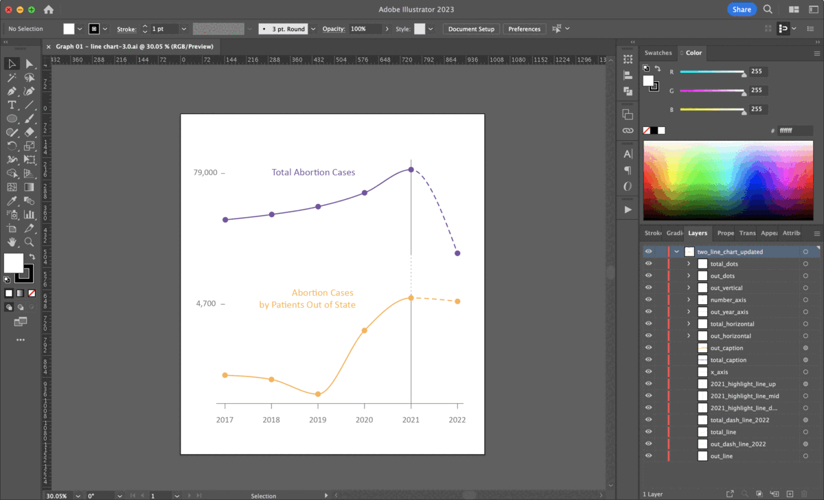
Designing visualizations and justifying my choices of types of graphics are a mixed bag of emotions. ➀ However, tools such as Datawrapper and Flourish allow me to quickly identify patterns in my data and gives me a sense of whether my choice of graphics is most optimal or can be encoded with other approaches.
After creating basic visualizations with Datawrapper, ➁ I used Adobe Illustrator to customize the graphics by changing the font, color and other design elements to align with the purpose and style of my story.
For those graphics with interactive features, ➂ I was using JavaScript to bring data to life and made it responsive to reader inputs, such as mouse clicks, hover actions, or dropdown functions.
Special thanks to Professor Vinicius Sueiro for his exceptional guidance and support in teaching me JavaScript, without his help, I would not have been able to create the dynamic and engaging graphics that now enliven my story. Sueiro meticulously instructed me how to write and develop JavaScript functions based on user needs and provided valuable feedback from a professional web design perspective.
Interactivity
Interactivity plays a crucial role in this web-based data-driven story as animation better engages people and creates a unique experience for readers who seek specific information, which leads to clearer and more effective mutual communication.
In this project, I mainly used Mapbox, Swiper.js and pure JavaScript to create the slider map ↗️ and line animation ↘️.
Swipe right 👉 to explore how I did it 🤡 or click story to interact with the graphics!
Before: slider map 🗺️
👈 In my draft version (BEFORE), in order to help readers better understand where the abortion facilities are distributed across the state, I tried to build scrollytelling site with ai2html and scrollama.js. However, the original version lacked visual appeal and the map was obscured by text, making it difficult for those unfamiliar with Florida to identify which counties were highlighted on the map.
It was also a big issue when reading the story on a mobile phone as the map (SVG) was not designed to be responsive for different screen sizes, in which case, the text, dots, lines, and other design elements on the map were cluttered together, making it challenging for readers to comprehend the graphic at all.
After: slider map 🗺️
👉 In my current version (AFTER), inspired by Sueiro's co-produced project Humanizing Covid-19 Data, I gave up implementing scrollytelling in my story and turned to Swiper.js for further exploration. With Sueiro's help, I integrated Mapbox with Swiper.js's slider function, resulting in a clearer and less confusing interface for my readers.
I'm listing the references I used for this map here: Getting Started With Swiper, Mapbox GL JS
Line Animation 📈
At first, I wasn't sure if it was possible to draw an animated line between two geolocations with my current programming knowledge, so creating a static line was my initial plan, in which case, Google My Maps did a really good job in automatically generating driving distance between two spots on the map. I also found that Mapbox | Directions API was a great reference to explore the route between two locations but it was still a static line on the map.
After trying various tools and searching for possible practical approaches that made sense to me, I came across this magic tutorial Update a feature in realtime by Mapbox GL JS which shows how to change an existing feature on a map by updating its data. The tutorial displays the progression of a path by adding new coordinates to a feature in a line layer.
However, it took me longer than expected to prepare my own data for JavaScript to fetch and customize the parameters of the code template in the tutorial. Eventually, with Adobe Premiere, I was able to edit a screen recording that showed the line being updated in real-time.
Reflection
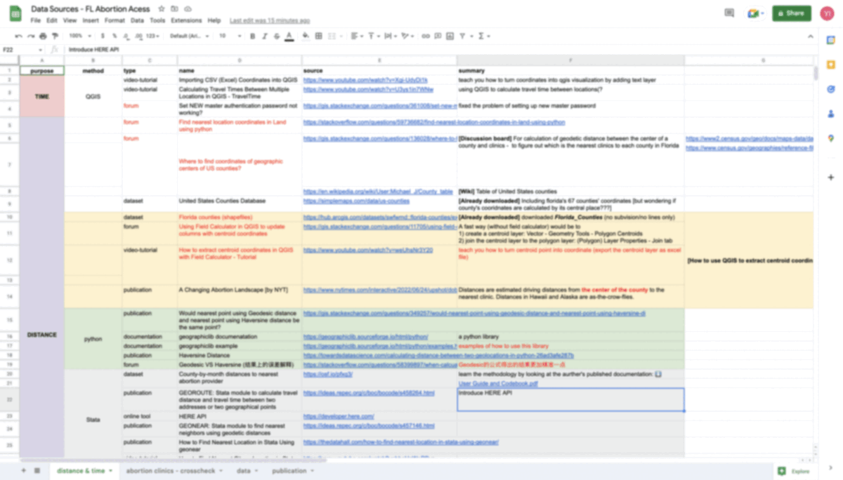
Track down research steps. Human memory could be unreliable, particularly when it comes to complex procedures. In this case, I have created a Google Sheet to specifically track down information and documentations that teach me how to use certain tools such as QGIS, Mapbox, Stata and new Python packages. The sheet not only serves as a reliable record of the information, but also provides an efficient way of organizing and categorizing it for easy retrieval. Having a written record also helps ensure that the steps can be replicated and readily accessible when we need to reference it in the future.
Fact check every number. This is an essential step for a data-driven story. I was sourcing yearly reported abortion cases released by AHCA while I failed to spot the fact that their numbers were Year-to-Date, meaning that the reported cases for 2022 were still being updated at the time I published the story, so make sure you double check the number and add a note when necessary to explain why the data is constantly changing.
Visualizations could be confusing. People understand graphics differently and what may seem clear to one may be ambiguous to another, so user testing is important as it examines how the graphics are being interpreted, in which case, you will get a chance to modify your color choices or graphic types.
Learning while making. This project marks my first time to code with pure JavaScript. Even if I have some experience working with Mapbox, the tool is still pretty new to me. Throughout the whole process, I was learning new things almost every single day. I browsed through forums like Stack Overflow, W3Schools, and GIS Stack Exchange to explore similar questions others have asked, attempting to resolve the bugs I encountered while coding by myself.
My Words
With the rising vogue of video storytelling among journalism students, it was a lonely journey where I could only learn from my own failures and had no one to share my progress with. However, it was also so fun to code with such uncertainties:
You go to bed with unsolved bugs in your mind and you wake up the next day with a sudden burst of inspirations of possible solutions. You then spend the next three or four hours working hard and trying countless ways to debug. Finally, just right before your next bedtime, you solve the problem that has been plaguing you for so long —— this happened almost every day to me during the past four months, which I believe there is nothing more satisfying and delightful than this.
My hard work was paying off and it was not just a waste of my life, which even made me start to believe in the cliche 🤡 that don't just give up until the last minute ;) lol. Alright, that is all I want to say and if you enjoy my work, then I look forward to seeing you in my next projects ❤️. Find me at ✨here✨.